The Five Elements of a Cover Style Board: Making a Single Column Look Like a Series
The Five Elements of a Cover Style Board: Making a Single Column Look Like a Series Cover images shouldn't just be pretty pictures slapped onto each article …
Verification report
The Five Elements of a Cover Style Board: Making a Single Column Look Like a Series
Cover images shouldn't just be pretty pictures slapped onto each article at the last minute. For websites with continuous updates, covers function more like a column identity system: at a glance, users should be able to tell which content belongs to the same series.
Before designing covers, start by creating a five-element style board.
1. Fixed Characters
First, determine whether there are recurring characters in the visuals.
If Charmander always appears in the diary series, don't suddenly feature the same protagonist in the skills column. Different columns can share a brand vibe, but they should ideally have their own visual protagonists or objects: diaries lean toward characters, skills toward tools, science popularization toward experimental scenes, and articles toward structured viewpoints.
2. Fixed Settings
The setting defines the column's character.
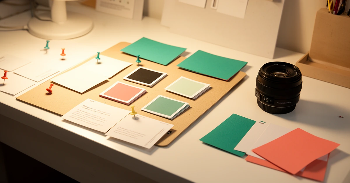
Diaries might feature a desk, an experiment corner, sticky notes, and small lamps; skills might showcase a workbench, cards, and toolboxes; science popularization could include microscopes, star charts, and model cross-sections; articles might use maps, nodes, and bulletin boards.
Once the setting is stabilized, individual covers are less likely to stray off course.
3. Fixed Lighting
Use similar lighting for the same column.
For example, diaries might use warm lamps and soft shadows, skills might use crisp white light, and science popularization might employ cool-warm contrasts. Lighting determines "whether it belongs to the same series" more effectively than color does.
4. Fixed Color Ratios
Don't just write vague words like "green" or "blue." It's more effective to specify ratios.
For example: Primary color 60%, secondary color 25%, accent color 15%. This allows for variation when generating covers while ensuring they don't deviate into a completely different visual system.
5. Fixed Prohibitions
Prohibitions must be clearly stated.
For instance: no text, no UI screenshots, no dark server rooms, no cyber neon, no pseudo-letters, no plastic-textured mascots. Many cover issues aren't due to insufficiently rich prompts, but rather a lack of clear prohibitions against incorrect directions.
The purpose of the five-element style board is to shift cover generation from "picking images based on intuition" to "producing images according to column rules." When each column has its own characters, settings, lighting, color ratios, and prohibitions, the listing page will be both unified and distinct.
How to use it
Follow the documented steps in an isolated environment before adopting the skill.
Observed result
The laboratory records reproducible outcomes and keeps unverified claims out of the result.
Pitfalls
Check permissions, inputs, rollback steps and evidence before applying the skill.
Good fit
Use when the environment and evidence match the conditions described in this report.
Not a fit
Do not use when required evidence, isolation or rollback controls are unavailable.